Case Study · DIGILYZR eWay
Reimagining a pharma sales app used by thousands of reps every day.
DIGILYZR came to Lost Circle with a product their field teams had to use but did not want to. We redesigned it into something they do.
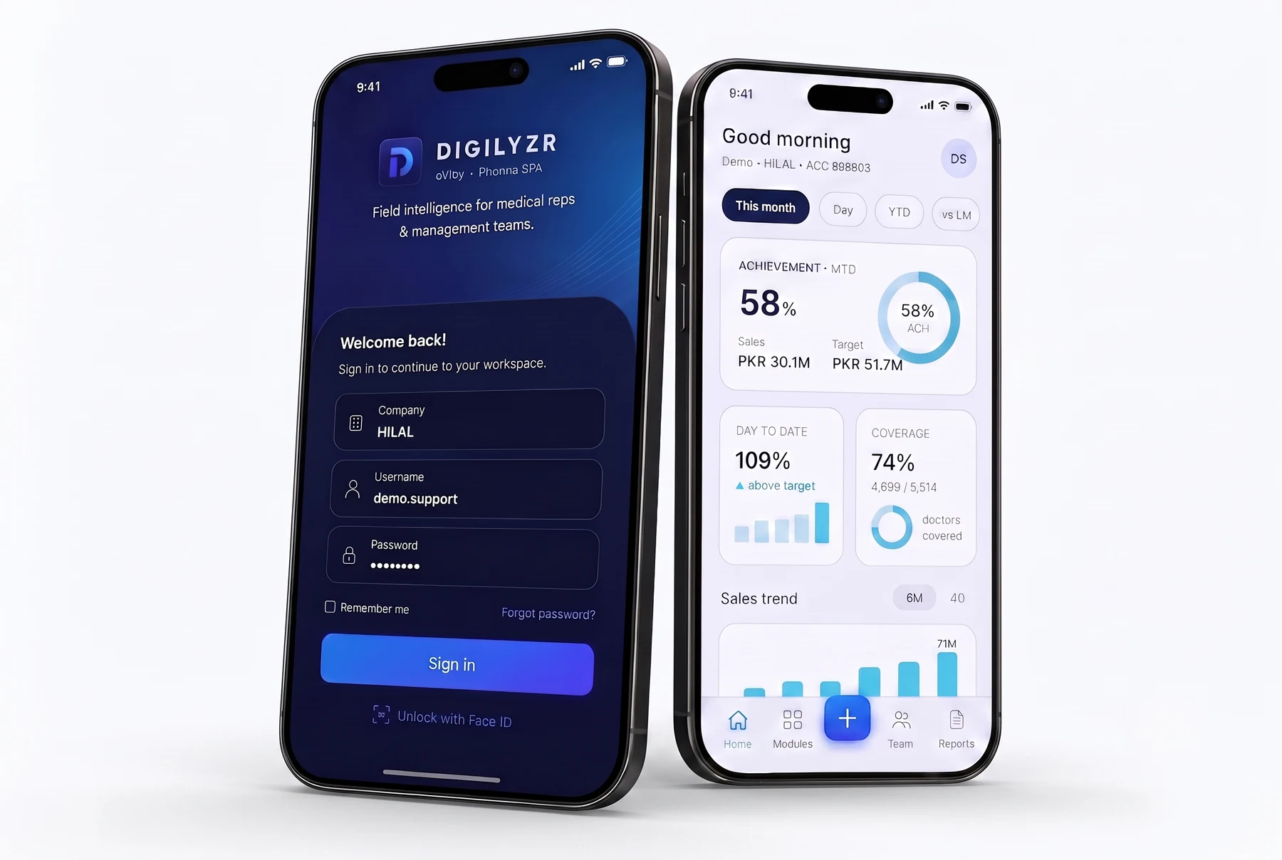
10 components
covers 80%+ of the full app
3 theme variants
Light, Dark, Emerald
£0 software cost
for Phase 1 build
14 days
from sign-off to first sprint
The situation.
eWay is a Sales Force Effectiveness tool used by pharmaceutical field representatives to track daily calls, log doctor visits, monitor sales targets, and report coverage. It is the product these reps open at the start of every working day and the one managers rely on to make decisions about team performance.
The problem was not that eWay lacked features. It was that the experience of using it had not kept pace with what reps were now comparing it to: the clean, fast, confident apps they used in the rest of their lives. Dense gauge charts, inconsistent layouts, raw API error messages, and navigation that required multiple taps to reach basic information had turned a critical business tool into a daily frustration.
DIGILYZR knew the product needed to change. They needed a partner who could redesign it from the ground up, not just make it look nicer, but rethink how it worked, how it communicated, and how it felt to use.
Project snapshot
Client
DIGILYZR
Industry
Pharmaceutical / Sales Force Effectiveness
Engagement
UI/UX Redesign + Flutter Build Plan
Platform
iOS first, Android to follow. Flutter
Services
Product Design, UI/UX, Mobile Development
The challenge.
The brief had three layers that had to be resolved inside the same design system.
01
Field representatives
Needed to understand their performance within seconds of opening the app, without digging through screens or interpreting ambiguous gauges.
02
Managers
Needed consistent, trustworthy data they could act on immediately, not numbers they had to manually reconcile across different views.
03
The product itself
Needed a single, scalable design system built once and applied everywhere, so future development was assembly rather than reinvention.
The practical constraint
The team could not rebuild the entire app at once. The redesign had to be sequenced so that Phase 1 delivered real value while laying the foundation for everything that followed.
A dramatic step forward.
The original home screen relied on colourful gauges and dense tables. The redesign replaces them with one achievement card, purposeful colour, and navigation built around action.
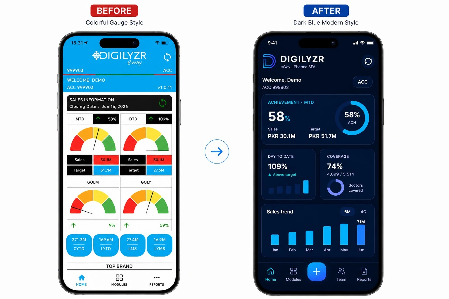
The original gauge-driven home screen next to the redesigned dashboard.
Before
Dense information hierarchy, colour used without meaning, raw API error states, and navigation requiring multiple taps to reach basic information.
After
One achievement card, one source of truth. Colour reserved for meaning. Friendly system states. Action-first navigation throughout.
Before
Different layout patterns across screens with no shared design language, making the app feel inconsistent and harder to learn.
After
10 components cover 80%+ of the entire application. Every screen speaks the same visual language.
Before
Fixed pie charts with no interactivity and limited comparative context.
After
Tappable trend bars, switchable sales mix views, sortable brand tables. Data you can actually use.
Our approach.
Start with one screen. Build the whole system.
Rather than spreading effort across the entire application from day one, Lost Circle made a deliberate call: take the Home screen to final quality first. Not as a placeholder, but as the design system foundation.
The Home screen carries the highest daily traffic. It surfaces the most important data. And it defines almost every repeatable pattern in the product: cards, charts, navigation, status indicators, typography, spacing. Getting it right once meant that Modules, Reports, and Team views could be assembled from the same components rather than designed from scratch.
"Perfect this one screen, ratify the system, and the rest is assembly rather than new design."
A design language built on discipline.
The core principle for the redesign was a simple rule: colour with a job. Every visual decision had to earn its place.
Green, amber, and red are reserved exclusively for performance data. Blue and cyan signal actions and interactive elements only. Generous whitespace is not decoration. It lets the numbers become the hero of every screen.
The reference point was not other pharma software. It was the best-in-class apps reps already trusted in other parts of their lives: Revolut, Starling, Chase, HubSpot, products that present dense information in a calm, confident, premium way.
Four goals. One direction.
Glanceable
Representatives understand their performance within seconds, with no digging required.
Fast
Fewer taps. Less searching. Every interaction optimised for productivity in the field.
Trusted
Clean, consistent reporting builds confidence in the decisions that follow.
Consistent
One design language applied across the entire application. No surprises.
What we built.
Lost Circle designed 10 reusable Flutter components that form the Home screen and carry forward into the rest of the application. Each reads colour from the theme, so it works across all three colour schemes with no rework. Try it yourself below: switch themes and tap through the real flows.
The real prototype, fully clickable: switch themes and tap through the flows.
Two themes, one experience.
The redesign ships with two visual personalities that share identical UX patterns and information architecture. DIGILYZR chooses the direction that best fits their brand.
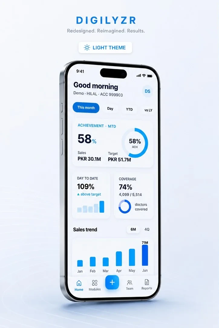
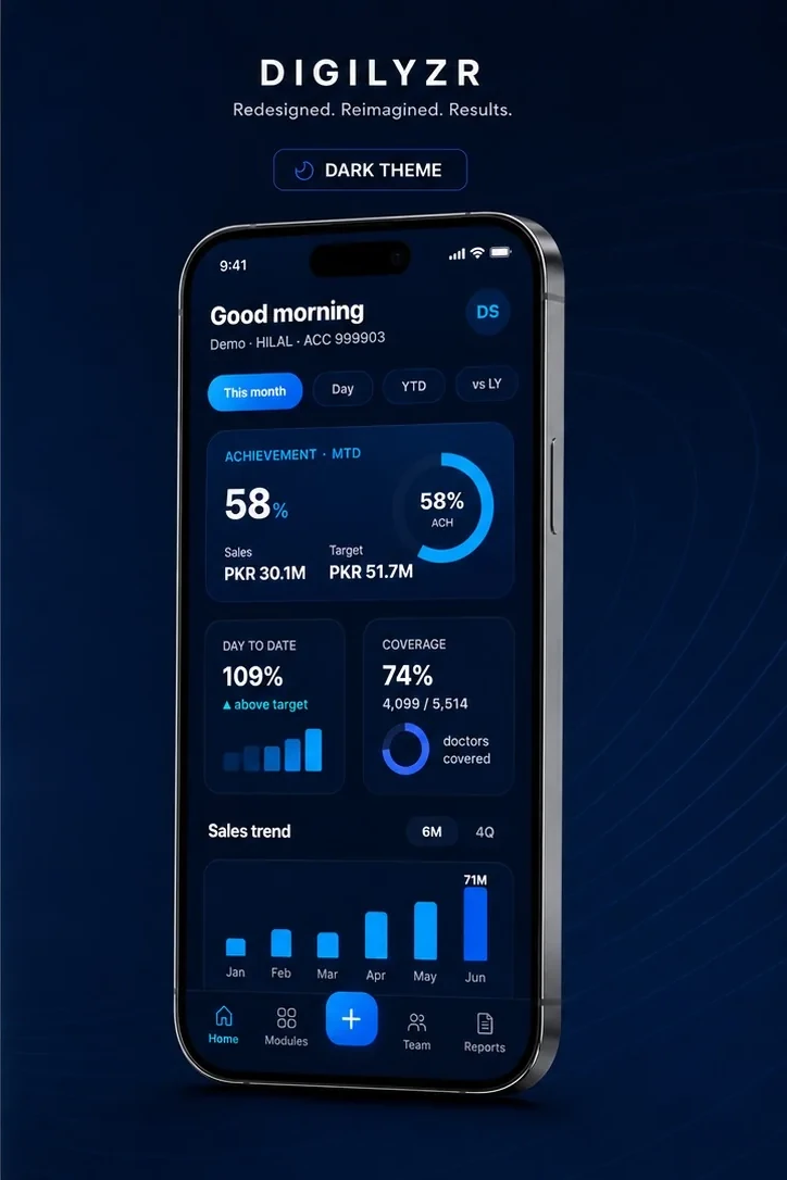
Light Theme
Clean white backgrounds with deep navy typography and cyan accents. Crisp, clinical, and professional, built for bright field environments.
Dark Theme
Deep navy surfaces with luminous cyan highlights. Premium, modern, and striking, a bold statement of enterprise confidence.
Built for managers too.
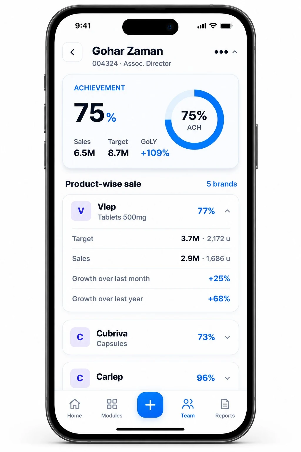
The redesign serves managers as directly as it serves field reps. A dedicated team view surfaces achievement, coverage, and brand performance in a single sortable screen, with consistent KPIs across the whole team, no manual reconciliation, and product-level drill-down one tap away.
Every representative's profile shows the same achievement card, product-wise sales, and growth figures managers see everywhere else in the app. One design language, no ambiguity, faster decisions.
"The best enterprise software does not feel like enterprise software. It feels inevitable, like it was always meant to work this way."
Why this matters.
Pharma SFA tools are used by people whose primary job is not sitting at a desk. Field representatives are moving, talking, and making decisions on the go. Every second spent navigating an unclear interface is a second not spent in front of a doctor or a customer.
The redesigned eWay treats that reality as the brief. Performance data is surfaced immediately. Navigation is predictable. The system communicates clearly even when offline or syncing. And managers who need to make fast decisions about territory performance can do so without waiting for a report to load or a number to be manually pulled.
Working on something similar.
Whether you have an existing product that needs rethinking or a new one that needs building, we would like to hear about it.